Graham McAllister, CEO at independent user research firm Player Research, begins his talk at Reboot Develop 2016 by explaining his role in the industry.
User research, after all, is nowhere near as established as a discipline within gaming as it is in other consumer-facing tech industries - a fact that clearly baffles McAllister, as he considers the need for it to be just as great.
Going in blind
He begins with the example of Rocketcat's Punch Quest - a game that received excellent reviews but, by the developer's admission, made very little money. Strikingly, the developer was utterly at a loss as to why.
Player Research took a retrospective look at the game, however, and found the monetisation issues to be glaring.
"What's frustrating is that these guys should have made a ton of money, they had everything going for them... but the motivation to spend was not clear," says McAllister, encapsulating the problem.
"Even if you're not money-motivated, you need to make enough money to start another project."
Stronger base required
But this is not just an indie problem, nor is it solely to do with monetisation. Even major mobile game publishers make fatal errors, and that's why McAllister chooses to focus on the base building strategy genre.
He takes four examples: Clash of Clans, Game of War: Fire Age, Boom Beach, and Star Wars: Commander.
Bad UI design causes delay and confusion.Graham McAllister
The odd one out? Star Wars: Commander, unlike the other three, does not ride high in the top grossing charts - despite leveraging a massive IP, having a team of experienced and talented designers behind it, and launching later.
"That's amazing, isn't it?" says McAllister.
In an effort to find out why, Player Research assigned 5 reasearchers to look at the first 1-2 hours of gameplay in each, for a report more than 250 pages long, taking almost a year, and costing £175,000 to produce.
The report tackles the UI and UX designs of each game in a level of detail McAllister describes as "mind-numbing - but these things matter."
Nobody's perfect
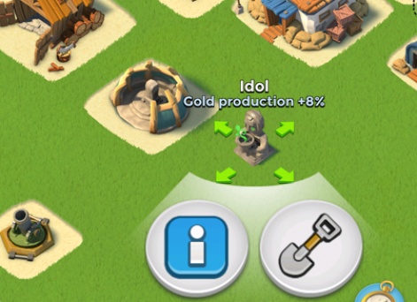
Supercell is not exempt from critique either, with Clash of Clans named the worst offender in tutorial design - specifically, the lack of clarity of your build radius.
"Players should be thinking about the strategic decision, not 'what does that red circle mean?' It causes delay and confusion, and that's what bad UI design does," he says.
It did, however, learn from its mistakes with Boom Beach, which is far clearer.
Another common issue among the four games is for the function of consumables to be unclear in battle - something that's extra irritating for the player if they've paid for them, and can lead the player to not bother spending again.
You'd be surprised how many big devs leave money on the table.Graham McAllister
In Star Wars: Commander, the "near-identical" ship icons used to represent consumables cause confusion. In Clash of Clans, it's the ambiguously coloured potions that are at fault.
"When it comes to presenting sales and offers, you'd be surprised how many big developers leave money on the table," McAllister goes on.
Examples include Game of War's scrolling sales page, which could result in some players failing to see the full list of what they're purchasing.
Top of the class
For an example of UI/UX done well, however, McAllister names Hearthstone.
Showing some sections of the report Player Research compiled on the game, he comes up relatively short of serious areas of concern.
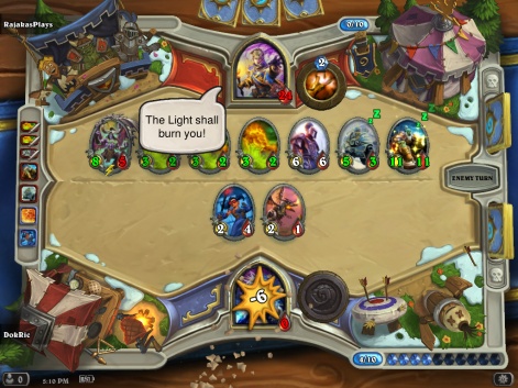
"If you want to make millions of dollars, do lots of good work," he concludes wryly.
"It's an unbelievably good job. We've never written a report like this ever before."
However, even an exceptional case like Hearthstone has some areas that could be improved.
Devil in the detail
Indeed, Clash of Clans and Game of War have issues, too - but they're not riddled with UI/UX problems in the same way as Star Wars: Commander, according to Player Research's report.
I can only conclude the developers didn't look in enough detail.Graham McAllister
Unlike Star Wars: Commander, "they demonstrate the value, and present it in a meaningful way," adds McAllister.
His overall message is one of frustration, and he sounds a warning to other developers out there:
"Star Wars [Commander] could have made a ton more money if they'd looked in more detail at user experience and what the player is thinking - and I can only conclude that they didn't look in enough detail. They thought it was good enough."
"Look at your competitors in more detail, and remember that game design is only half the story."
To request access to the 68-page sample report, you can contact Player Research via info@playerresearch.com.