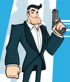
You can read the first Art of Agent Dash column, which focuses on 2D art, here.
At Full Fat we make bright, vibrant games that have their own style suitable to the genre.
From realistic stadiums in NFL Quarterback to playful space levels in Coin Drop!, we work hard in 2D and 3D to get a look and feel that people will want to play, and keep playing.
After all, it's important to engage the player from the first screenshot.

Full Fat's Matt Isaac
When it came to Agent Dash, we decided on a spy theme very early on, as it's an exciting subject matter with many possibilities and avenues to explore. From an artistic perspective, it was especially good as we could throw in lots of crazy ideas and make fun models throughout the process.
We also felt that the theme leant itself to parody well, which opened up the scope to many influences.
Underway
It's very important from the start of a project to create a unified theme that everyone is familiar with and can relate to.
Concepts from our awesome 2D guy and reference gathering are vital to get everyone on the same track if you want it to look consistent.
As it happens, development in 3D actually started a few weeks before 2D because of commitments to other projects, so we spent that time gathering inspiration and blocking out levels and characters, as well as overcoming technical hurdles like our lane system, how to place collectibles and working out how to avoid draw-distance issues.
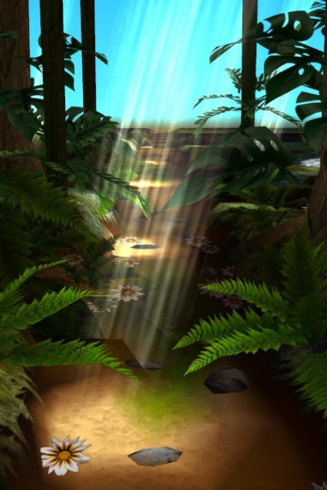
A very early shot of the Jungle level from Agent Dash.
The basic concepts for the levels and characters were all decided during this time, which enabled us to make good progress from an early stage. I was keen to keep the style simple and fun with bright, saturated colours and little to no 'noise'.
From a technical point of view, simple noiseless textures take up significantly less memory so we were able to pack a lot into the game to give it depth and flair.
We also felt the levels and characters should feel very distinct from each other to provide variety and a clear sense of progression.
Character creation
Before 2D concepts, I blocked out a couple of characters with exaggerated and stylised body proportions focusing heavily on their silhouettes to ensure each read differently from the others.
It's important in a game like Agent Dash to give characters their own personality and shapes that are instantly recognisable.
Once Russ [Cogman, author of the previous Art of Agent Dash column] had provided some concepts, the characters were reworked to the new style, which improved on their look and presence significantly.
Concepts and colour-tests were provided for the levels as well, to ensure consistency and cohesiveness.
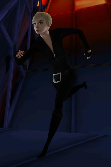
A runner before style and lighting. After more cartoony concepts the character improved dramatically.
Levels started out much like any other game: white-box segments to test gameplay and readability. If you look closely you may notice that whether you're running in the Jungle, Base or Town, the geometry of the lanes on the track pieces are the same.
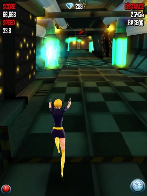
The same runner - as she appears in the final game - destroying an enemy base.
Gameplay versus art
I fundamentally believe in 'gameplay above all'. It has to look good, but it has to play well as a priority. Getting this balance is always going to be one of the most important aspects of game art.
Good examples of this are the obstacles you have to jump or slide over through your run. At first we tried quite detailed and fun models, ranging from leaky pipes to air-dropped crates but we quickly realised that, once the player approached top-speed, visibility became a major problem.
After many play-throughs and tweaks, we concluded that the obstacles should always primarily consist of large blocks of colour, preferably similar shades through the game, and should be obvious even at distance.
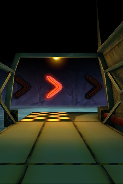
It's important to signpost obstacles and use clear blocks of colour.
Our aim was to ensure that whenever you hit an obstacle in Agent Dash, you feel as though you would have made it if you had reacted faster, not that you got cheated by the design.
The light fantastic
Lighting is an interesting topic in Agent Dash because we don't actually use any in the game.
To keep a consistent cartoony feel, our technical and environment artists Bela and Yi-Mei baked the level lighting in to light maps which enable us to get nice-looking shadows and highlights without making tons of textures.
Our characters give the illusion of being rim-lit, yet achieve this through an environment map which highlights the edges of the model.
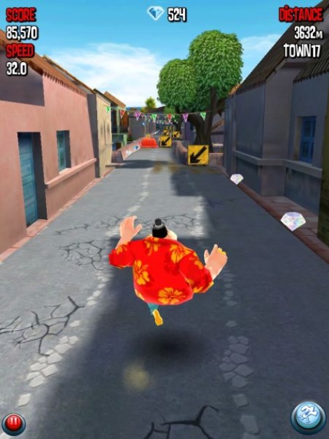
An unlockable character from the finished game.
Animation was a major component of development, with Julek providing over a hundred excellent and hilarious animations across the characters and objects.
We were keen to be quite slapstick in style and imagine a personality for each character so we could determine how they would react and move to the situations they encounter.
Working on Agent Dash has been a fantastic learning experience for us in how we create and develop content.
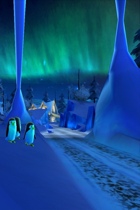
A glimpse of things to come?
And it still goes on, an update is due out very soon that we're super excited about so stay tuned for that!
For more information on Full Fat, check out the company's website, where you'll find information on the company's portfolio of games as well as several job openings including a number of art and design roles.

