"You know iOS 7? The word is, they're going to get rid of all the shiny buttons."
It's something I've got in the habit of saying repeatedly in recent weeks, if only to poke the folks I know will give me the reaction I'm after: abject horror.
In truth, it's only the true Apple zealots who respond that way, and I'm not sure even they know why. My guess is, when you're top dog and, believe me, Apple fans love the fact the firm is top dog any kind of change represents a risk.
Of course, as any business that's fallen from grace will tell you, it's important to instigate change before it's apparent that it's needed. Wait until people are calling out for it, and it's already too late.
Evolution, not revolution
Actually, I'd argue that most iOS developers believe the platform could do with a little spruce up, both in terms of its visuals, and the way the OS operates.
If rumours are to be believed, that's exactly what we're going to get albeit maybe not all at once.
Ever since Jony Ive took charge of interface design at Apple, commentators have been expecting him to call time on iOS's obsession with skeuomorphism - that is, mimicking real world objects within design.
The word is, that's exactly what he has in mind, with for example Game Center's green felt table apparently living on borrowed time.
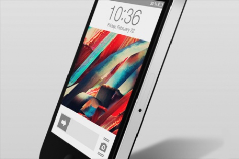
iOS flat design concept, by David Samuel Einenkel
In exchange, sources are pointing towards a new 'flat' design, with icons that look like they've been soaked in hot wax set to be consigned to the rubbish bin.
Indeed, it would appear the deployment of Microsoft's Metro approach utilised across both Windows 8 and Windows Phone 8 may have had an impact on Ive, with a unified notification centre also on the cards.
The problem is, such a radical overhaul is proving to be somewhat time consuming. Sites are pointing to Ive's team rushing to deliver the platform in demo form at least in time for WWDC 2013 in June, with OS X engineers switching focus to iOS 7 in order to hit said deadline.
Step by step
As a result, it appears alterations will be staggered: superficial changes to the way iOS looks will be deployed in 2013, while more fundamental changes to the platform's core may be put off until 2014.
And maybe that's just as well. Changes to the appearance of the platform will be easier for loyal consumers to handle to couple that with a radical shift in how it operates may be too much to handle.
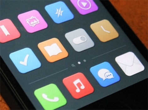
iOS flat icons, by Manu Gamero
While I've long called for Apple to do away with its 'rows and rows of apps' approach and learn from the way the likes of Microsoft and even BlackBerry are helping to evolve the smartphone user interface, I'd argue looks are actually just as important.
One of the reasons I don't own an Android device the one major smartphone OS I've never succumbed to is because, outside of Google's naked version, it looks tacky as hell. The skins applied by Samsung, HTC, LG and the like cheapen every device they run on.
They're cluttered, they're messy, and they're incoherent. In short, they don't exact look 'smart', having more in common with the UIs users were saddled with during the Symbian era.
To be worth the investment they represent, smartphones need to look slick and expensive, and that extends far beyond the actual hardware.
Shiny happy people?
iOS is by no means as visually offensive as the aforementioned Android offenders, of course, but the basic premise behind the platform's design hasn't really changed since in 2007.
A UX designer suggested to me last night that, perhaps, Apple should stick to its guns and ignore the current "fad" for flat design.
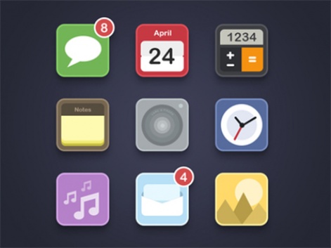
iOS flat icons concept, by Shai
All fashions are essentially fads of varying lengths, however, and it can be coincidence that some of iOS's biggest third party apps adopted it long ago - Vine and YouTube both of note - from icon design right through to the UI of the apps themselves.
The longer Apple holds out heading down a different, shinier path, the more difficult it'll be to turn the corner in the years to come. The change needs to start now.
My main message is, it won't come easy. Developers and Apple alike need to be prepared for a vocal minority to voice their discontent at any hint of a change, while for others, it's likely that whatever is shown at WWDC 2013 won't be enough.
In short, Mr. Ive should prepare for faces currently flooded with fear to either be enraged with anger or saddled with disappointment come the big reveal. You can't please everybody.
