Feature

5 simple steps to designing the perfect app icon

How to land on a user's home screen and stay there

5 simple steps to designing the perfect app icon

Human beings are superficial creatures. Despite the fact that we all love the idea that we only judge something on the quality of what lies within, external appearances always have an impact on our final decision.

And no, despite what you think, we're not talking about dating here – rather, we're talking about the way app icons influence the decisions consumers make about which titles they or do not download.

Because those little tiny squares – sometimes with curved edges, sometimes not – have a genuine impact on just how many downloads your title can amass. What's more, poorly designed ones can result in your release being rejected by the platform holder.

At WWDC back in June, poor app icon design was listed as one of the top three reasons developers find themselves banned from the App Store. Ouch.

So, kind souls that we are, we've elected to serve up a short and snappy guide to delivering the perfect app icon one that will enable you to keep the platform holders happy and, in the process, please a few consumers along the way too.


Click here to view the list »
  • 5 Research design trends

    Remember all the hullabaloo about the shift from iOS 6 to iOS 7 in the past few months?

    For developers, any update to Apple's OS tends to revolve around ironing out any bugs the new version throw their way, but this time, iOS 7 had another trick up its sleeve. An entirely new look.

    Yes, iOS 7 went 'flat', which as a result, changed the way consumers view their home screens and – most importantly – what icons they want sat on them.

    Gone was the skeuomorphism of the original OS and the fake materials that came with and in came the aforementioned Jony Ive approved flatness, with bright colours and subtle shading aiding Apple's icons with the "follows your eyes around the room" 3D effect of parallax.

    While developers on rival platforms, such as Windows Phone, were well used to keeping their app icons 'flat', Apple's change in direction meant iOS developers had to make a big shift to fit in with the new way of doing things.

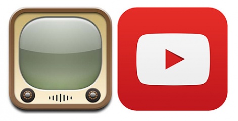
    Just take a look at YouTube's icons below: the old novelty TV would look ridiculous on iOS 7 in comparison to their newest iteration.

    Evolution is the order of the day in design and, while you've always got room to say no to it, fitting in with it makes sure that people searching for apps or displaying them on your home screen are more likely to keep them.

    Apple's old YouTube icon vs. Google's latest 'flat' version

    So, before you set out to make your icon, sit down with your good friend Google (or Bing, if that's your poison) and make sure you know which way the prevailing winds of design are going to make sure you can get them into your app's sails.

  • 4 Scope out the competition

    While you do have to make sure that you're sticking to design convention of the day to ensure your app icon fits in both on user's home screen and, perhaps more importantly, your chosen marketplace, standing out from the crowd is equally important.

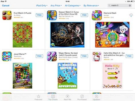
    Finding the right balance is anything but easy, but a quick look at how packed certain genres can get – such as a search for "match 3" games on the App Store below – just proves how important it is that your icon offers some form of distinction.

    As Mark Stern, UX Evangelist at Apple, said in a recent talk, "if an icon looks great, and it's been carefully crafted, it's reasonable to assume that the rest of the design of the app is also great and also well-crafted."

    Take the time out, therefore, to spend your time searching through the App Store and other marketplaces for potential gaming rivals, identify which ones stand out and thoee that fade into the background and create a portfolio of the best to help inspire you onto design greatness.

  • 3 Give it a bit of character

    One of the best things about gaming is the creation of memorable characters. Gaming icons that both catch your eye at the time and, even years on, retain a special place in the player's memories.

    Whether we're talking Mario and Sonic, or – to bring things up to the current day – Trevor in Grand Theft Auto V, special characters have a habit of burning themselves deep into the player's brain and, as a result, helping to translate the game they inhabit to the audience.

    They also happen to be great for helping to make your app icon stand out from the crowd.

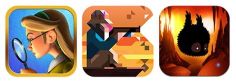
    Take a look at the examples below: Murder Files, Ridiculous Fishing, Badland. The characters players invest their time and money into are up front and making their presence known on the App Store front.

    Based on this advice, your major challenge is showing off your main character in the best possible light to get attention within the icon, with the above serving as valuable examples.

    In all cases, the characters dominate the image, but each takes the opportunity to inject their icon with character.

    Vlambeer's Billy is letting off his ridiculous machine gun rounds, the quaint iOS 7 friendly Hannah Dakota captures Murder Files quintessentially Britishness and Badland balances the game's superb environment with its protagonist to produce a strong image.

    By bringing out the character in your game into your icon, you put the stamp of individuality on your title and makes sure that users identify your game as something distinct from everything else.

  • 2 Keep things simple

    As with all things related to mobile, simplicity is essential to success when it comes to icon design.

    Even after the 'phablet' revolution, screen sizes are still relatively small and an app icon either in an app store or installed on a home page has little more than a few square centimetres to call its own - a factor that can lead to disaster if you aren't careful.

    That's something Axel Hunter, a freelance graphic and web designer, believes. To him, simplicity is at the heart of everything.

    "When it comes to the design of an app icon I am a firm believer that less is more," Hunter told us.

    "As well as looking cool, having a simple design also means that the designer can choose a particular essential element and polish it instead of overloading and cluttering the icon."

    So how can you keep things simple? Hunter has one major rule to follow that'll help you along the way.

    "Strong, simple design is key featuring one single graphic that has a strong relationship with either the brand or the app's theme," he concludes.

    In short, that means you need to give essential graphical elements room to breathe by discarding text from the icon, selecting from a small palette of relevant and complementary colours while creating unique shapes to help you stand out if your game isn't character driven.

    In the land of the short attention span, those who can make their point quickest will win. So always keep that in mind when you're finalising your icon design.


  • 1 Test, test, test

    Doing all the above is likely to get you most of the way towards designing a great icon but, chances are, you'll won't know you've struck gold until other people see it. Advice from third parties can make all the difference.

    For instance, if you've got a character driven game and you have four amazing characters, who do you feature?

    And if you haven't got a character in your game (perhaps you're making a puzzler) would it be better to feature, say, an in game gem or would it be better to come up with a unique design instead?

    The answer can be tough to find through the app stores themselves, as it's difficult to pin down a game's success or failure specifically to its icon.

    Fortunately, Meaghan Fitzgerald, head of marketing at 23snaps has come up with a great way of working out which icon works best – all via the power of advertising.

    "Coming from a web marketing background, I used to A/B testing every element of my marketing campaigns so it was strange to move to a mobile world where that is much harder," Fitzgerald told us.

    "However when it came to the app icon, I wanted to do some more research on how we could optimise the icon itself. That got me thinking about how we could use our existing marketing channels, like Facebook and Google ads, to test out different versions of our icon and see which got the best click through rate with an audience similar to our existing user base.

    "We did the test with Facebook ads, which were inexpensive, as we wanted to drive awareness of our brand on Facebook. We kept the text in the ad exactly the same in every variation but just changed the icons - we had three different options.

    "In the end, there was a pretty clear winner, which ended up going into the App Store. It was a great way to test the icons before we committed to a winner."

    Pretty handy stuff then. Best of all, it's very easy to set up.

    You can set up a string of adverts boasting each of your icon variants on an ad network with a tiny budget in a couple of hours from scratch and get the results back within a day - an invaluably quick turnaround for information that'll help you make sure that your app icon shines on the App Store pages.

    So that's our five step round up to creating an iconic app icon for your game.

    It may seem like a small thing, but a well designed icon can lead to more downloads, keep your app on a user's home screen and can even help boost any press coverage you get; a perfect antidote to those who say that size matters.

    Was this useful? Check out our other 5 simple step guides, 5 simple steps to the perfect app store screenshots, 5 simple steps to the perfect app store description and 5 simple steps to translating your game into new languages.

Staff Writer

George Osborn (no, not that one) has been ensnared by PocketGamer.biz to write words for them on pain of death/in return for money. He works with the events team to produce pitch perfect editorial for Pocket Gamer's ever-expanding events schedule, as well as working on advice features and articles to help game developers make the most of mobile.