Following a thousand little pocket fumbles, a thousand moments of skin-to-skin contact, and a thousand tiny exchanges of bodily fluid, they swarm out in search of a place to germinate and bear fruit.
For many of them, though, this journey is doomed to failure.
Unable to compete with their more vigorous rivals, the weaker specimens succumb to the forces of natural selection and find themselves languishing in the bottom of an old bag along with some forgotten socks.
Yes, business cards are the sperm of the networking world. And that means events like PG Connects in London are basically vast mating rituals.
Pass it on
In order to get the best out of these opportunities for mass business insemination, you need to ensure your card stands out.
And so, in an effort to help you achieve that aim (and, in truth, to help us clear out the piles of cards currently cluttering up Pocket Gamer Towers), we've compiled a small list of the cards that stood out when we were doing our post-show shuffle after PG Connects.
For the sake of balance, we've also chucked in some of the ones we don't think work quite as well.
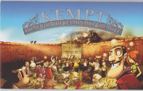
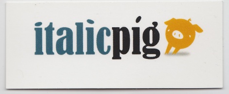
I first got this card at the Big Indie Pitch in Cologne last year. And whenever I come across it while rooting around in my drawer, it catches my eye.
No bells and whistles - it's just a nice, thick classy-looking card with a beautiful picture on it. I picked it up again at PG Connects last week and, testament to its quality, it inspired me to pen this very article.
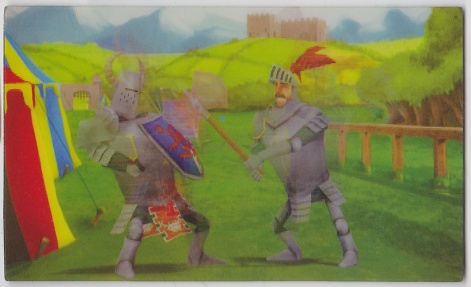
The charm of this card for Knighty-Knight isn't evident in a still picture. But if you have the real thing in front of you and you tilt it in the light, it changes. That's because it's a hologram.
I'm not usually a fan of gimmicks, but this one is clever because it doesn't get in the way. Whenever I come across this card, I treat myself to a little bit of hologram fun.
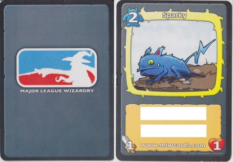
This is the back and the front of the card for Major League Wizardy. You don't need me to tell you why it's great, but I will anyway. The game is about trading cards and this looks like a trading card.
It's a gaping open goal of a concept, and you probably won't be so lucky. But it demonstrates that if you can theme your card around your product, the result can be highly effective.
We've moved into the subjective realm now. And all I can say about the next few cards is that I think they're pretty.
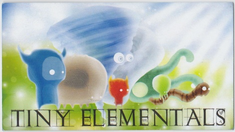
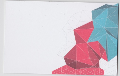
This card for Tiny Elementals stands out to me because its designer appears to convey something about the mood and tone of the game here.
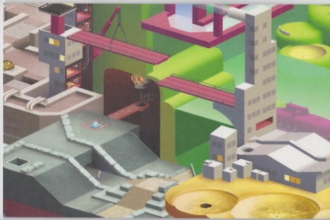
And the person responsible for this beautiful detailed illustration on the back of Damp Gnat's business card does the same thing albeit for a company rather than a game.
From the design of the card, we can infer that Damp Gnat is clever, imaginative, versatile, modern, appreciative of gaming's isometric history, and pretty promising all round.
While it's not particularly elaborate, Exocet's card is clean, stylish, and contemporary. It makes me want to turn it over, which is all you can really ask.
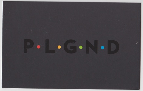
As with Knighty-Knight's holographic effort, this inert picture can't do Playground Publishing's card justice. It's black (which is arresting in itself) and the letters are glossy (so that they change in the light, turning dark, glistening, or vanishing against the background).
The coloured dots are a simple modern touch. It's the sort of card James Bond would have if it made any sense for a spy to have a card.
And now, after celebrating all that is good about some of the best business cards I've picked up of late, here are some errors to avoid.
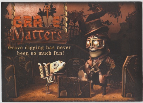
This card for Grave Matters - a very pretty take on Minesweeper - is way too big. You can't tell in this context because I've scaled it to fit the page like all the others.
Trust me, though: it's massive.
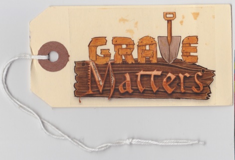
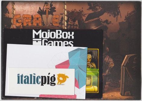
And this one is too small. Not only that, but it's a luggage tag. While I have nothing against Grave Matters, I have no use for a novelty luggage tag bearing its name.
Here's the thing about cards: we need to store them. And the best way to do that if you're not a slob is in nice neat piles. It's impossible to make piles with gimmicky, irregular cards, and so the maker of this Grave Matters card fails despite taking two attempts.
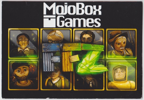
This one is too big, as well.
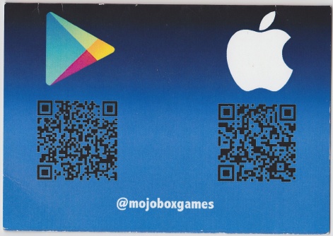
But it does at least have QR codes on it, which is an excellent idea.
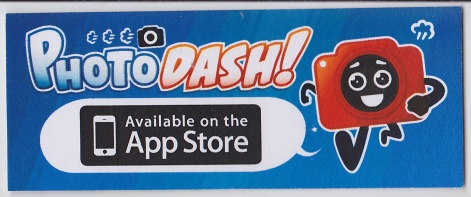
Whereas this one, and...
...this one are both too small.

See? Try making a neat pile out of that lot.
Rob Hearn is senior editor at PocketGamer.biz publisher Steel Media.