Nonetheless, as part of what appears to be a far wider rebranding exercise, Nokia has lifted the lid on its new font dubbed Nokia Pure claiming it celebrates the "purity of form" while remaining loyal to the firm's design roots.
Pure power
"For a brand like Nokia, looking to reinvent and revitalise, the typeface literally sets the tone," the company says on its website.
"In many ways, its the touchstone for every other visual element in the branding palette. So it needs to be considered, rigorous and send out exactly the right message."
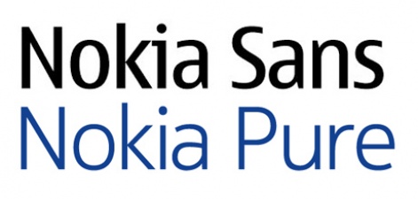
Nokia Pure was developed in conjunction with the Swiss-born, London-based typographic designer Bruno Maag, though the terms of its actual application appear unclear.
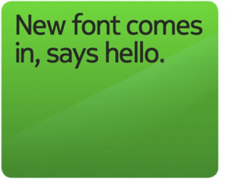
What the font?
Nokia itself claims the font was chosen partially because of its suitability for smartphones and, as such, its clarity even when viewed at its smallest size.
"Nokia Pure is contemporary without being fashionable, which should give it longevity. It's one thing drawing a beautiful letter, but another making a whole set work to a high quality. A coherent typeface is an essential part of a coherent branding strategy."
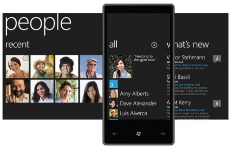
However, given Nokia's future device line is set to be dominated by Windows Phone 7 an OS that comes with its own font dubbed Segoe WP (below) across all OEMs and carriers it's unclear where Nokia Pure will be employed.
There's an undoubted similarity between Nokia Pure and Microsoft's Segeo WP, though whether the Redmond giant will allow its new partner to muddy Windows Phone 7's waters with a fresh typeface remains to be seen.
[source: Nokia]