
A little over a month ago, we put together a quick five step guide to writing a tip top app store description designed to help indies push themselves a little along the marketing track.
But there's another big marketing asset that's difficult to master but can make all the difference when it's got right: screenshots.
Like a form of virtual packaging, screenshots are the wrapper around your game that can make the difference between a consumer tapping that download button or swiping the screen across to the next app.
With only five shots allowed for each title and some frankly ferocious visual competition - knowing how to stand out is essential for getting ahead.
So here are our five tips for serving up high quality screenshots of your game to get the window shoppers freeing up a few megabytes on their device for your title:

Know which rules to follow (and which to ignore)
Apple has always been notoriously pernickety about what makes it onto its App Store and what doesn't, and like other OEMs that stickler for the rules attitude extends down to your game's screenshots, too.
In case you weren't aware, every app you add to the store has to sport at least on screenshot, and they have to fit within the size conventions outlined in the iTunes Connect developer guide.
On top of that, Apple also delivers a whole number of recommendations within its 'Use the App Store to Your Advantage' section, sporting such nuggets such as advising against placing a screenshot within an image of an iOS device, or overworking the images with marketing messages.
Both, however, are ignored by many, as the success of such apps who sport such tactics have proved they can, on occasion, ignite interest in the games behind them.
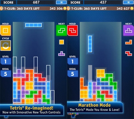
EA's Tetris - Definitely no marketing messages here
So, when compiling your game's first screenshots, make sure you abide by the technical elements within the rules of the app store you're targeting, but don't curb your creativity in order to follow advice from the platform holder to the letter.
They have their own interests to look after, and when it comes to the success of your title, they don't always know best.
Master your marketing message

Now you know where the boundaries lie, it's well worth taking the time to work out exactly what it is about your app that you want to communicate to your potential audience.
Why? Because screenshots are kind of like a little virtual flip book that can help tell the story of your game and outline what are hopefully its great features features, lets not forget, you've spent months working on.
That means you're going to have to sit down and really work out just which features you're going to focus on communicating.
So, take hold of a piece of paper or open up a document on your word processor and brainstorm two elements: first, what you think is the big reason why people will enjoy your game and, second, the four or five biggest strengths of your app.
Getting those things in hand will offer you a great base to creat a short text driven narrative for your game's page on the app store, supported by appropriate screenshots.
Andy Watts, a graphic and UX designer specialising in mobile, emphasises that a screenshot isn't just a bit of art; it's a chance to tell your games story.
"Each screenshot is making a point about your app to the user," Watts tells us. "By sticking to one point for each slide and sticking with a bigger overall narrative, it helps people looking at your app to understand its strengths and makes sure any text you add is kept short and sweet."
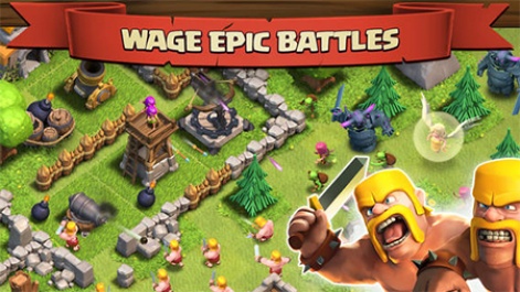
A great example of this approach is Supercell's Clash of Clans.
By highlighting the epic battles, clan gameplay and single/multiplayer game play in the screenshots, it really sells itself as the "epic combat strategy game" it claims to be at the top of its App Store description.
Images are worth a thousand words

While text can have a part to play in creating strong screenshots, the big truth is that the majority of your time should be spent on mastering the visuals.
The relative signs of mobile screens mean app store browsers aren't especially generous when it comes to real estate for games, meaning the amount of time you have to drive casual downloads is especially tight.
Text, therefore, plays second fiddle to visual elements, which have the power to win people over in a matter of seconds.
That's something that Katherine Leonard, content developer at HY Connect and writer for lonelybrand.com, agrees with. In her book, a good screenshot can serve as either a sale in the bag or an opportunity to convince a passing customer.
"With limited space and copy, it's tough to market your app within the App Store or Google Play," details Leonard.
"If you can convince interested parties to click through to the product page, you're able to get a download or open up an opportunity to communicate a bit more information with your description text."
And the most effective way to make your screenshots a visual feast is to use the visuals themselves to show off your game's strengths.
According to Leonard, your images are the chance to connect with people hovering over that download button and make sure your title stands out.
"Visuals allow you to show rather than tell why your app is worth the download," concludes Leonard.
"You can easily plug in five straightforward screenshots, but you might as well get the most out of these assets. Be creative and think of how you can use the frames to show users the value of your app."
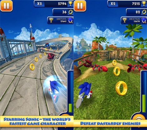
A great example of how to let your image do the talking is Sonic Dash.
The infinite runner benefits from Sega's iconic mascot being the game's leading man as it were, so the decision to open up the first screenshot with an image of Sonic in Green Hill Zone means it creates an instant visual effect in the minds of millions.
So, even though it contains a bit of marketing text to support the message, the image alone is captivating enough to bring in the casual browsers: something you should be aiming to do with each of your images.
First impressions count

Never judge a book by its cover people say. Sadly, all too many are the gamers who will judge your title almost subconsciously by your first screenshot.
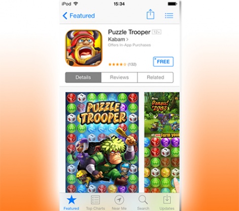
As if to illustrate the point, pretty much every screenshot picked for this article has been that particular game's first. Why? Because those shots show how devs bring their A game up front, as well as illustrating how most people make their app choices.
To hammer home just how important it is to get the first screenshot right, here's a quick screen grab of the app page on iOS 7 which, based on previous performance, is about to snap up the best part of 95 percent of users when the update officially rolls out.
As you can see, only the first screenshot is fully displayed on the iPhone/iPod Touch version of the store, meaning it is very much top dog when it comes to getting user attention.
How exactly do you go about making that first impression count, then?
Focus on being visually arresting. Obviously, this can mean many different things depending on what kind of game you're promoting, but a few notable tactics stand out.
One approach is to get your big guns out from the off an approached favoured by the likes of EA in the case of Real Racing 3, which has an initial screenshot that sports the triple whammy; great graphics, a Porsche branded car, and a famous race track.
Real Racing 3's first screenshot is a portrait affair, with the rest opting for the landscape approach
Other approaches can be equally effective, however, such as the award name dropping of The Room, the stylistically striking approach of Limbo or the character driven approach of Animal Voyage.
Whatever approach you pot for, the most important thing to is to make sure that you're rolling out your design A-game for the first screenshot it really could help you to scores of extra downloads.

Test, test and test again
But how do you know just which screenshots work best in the first place?
This is where a bit of old fashioned A/B testing comes into play testing two pieces of similar creative separated by just a few minor changes to make sure of its success.

But, given Apple and other OEMs don't allow you to test such elements through the store itself, how exactly can you calculate what works and what doesn't?
One answer is to test the artwork in question within a regular ad campaign. App consultant Stefan Bielau recommends that you come up with ads that mimic the app store experience to help you find out which of your screenshots is most effective.
"Create a mobile landing page or a mobile interstitial banner that includes the icon, description, screen shots and 'install' button and try to replicate the experience users will have when they view the app in the store," recommends Bielau.
"Then create a mobile ad that leads users to those landing pages randomly and measure the Click Through Rate (CTR) for installs to see what percentage of visitors download the app.
"After you've done that, you can go ahead and make the most 'clickable' ad your first app store screenshot."
So, if you're having a bit of a creative battle or you're not sure your hunch is right, simply spending a small amount on advertising (as little as $50-$100) could help ensure that your screenshot designs are perfect to drive download downloads that have the potential to pay back that initial expense many times over in the long run.
Conclusion:
Mastering your screenshots is something that, undoubtedly, will take up your time and even cost you a few dollars, but creating memorable and effective artwork for your game will aid it rise up the charts and generate a higher rate of downloads.
It will also serve up great materials for future marketing campaigns materials that the press will be eager to get their hands on if you title amasses a notable level of success.
Beauty is in the eye of the beholder, of course, but the more people who see that beauty in your game will download it, so make sure you smarten your screenshots up to make the right impression.


