
I'm currently porting Titan Attacks by Puppy Gamesto mobile and, as part of that process, I've developed a dynamic user interface (UI) system.
By dynamic, I mean that the UI not only configures itself based on the device form factor - screen size - but it can also adjust itself to the device orientation on the fly.
A dynamic UI is important because coding a separate UI for each possible mobile screen size would take forever. Also, changing the UI based on the device orientation makes the game feel slick and allows the player to hold their mobile device in their preferred style.
As such, I'm going to focus on device detection, iOS screen sizes, scaling the UI to fit and changing the UI orientation in this week's Full Indie UK column, with the hope of explaining why mastering a dynamic approach can pay dividends.
Device detection
As an example of what I'm talking about, take a look at this title screen in both portrait and landscape orientations on an iPhone 4S:
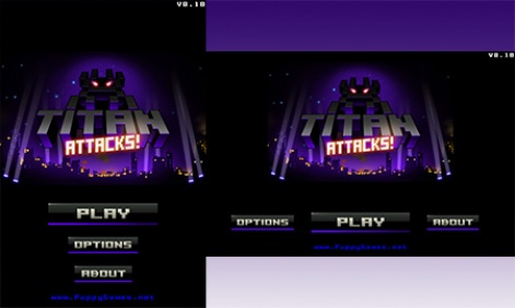
You can see that the menu is a vertical column of buttons in portrait mode and a horizontal row in landscape mode. I haven't just tried to squish the menu into a totally different form factor because that would look bad and might also be awkward to use
It's not essential to know the device type as I could just use the orientation to configure the UI. However, for Titan Attacks I'm using the device type to set the default control system depending on if the player is using a phone or a tablet.
As a result, on iPhone there's a simple slider control, and on iPad there's a slider with a separate fire button - see screenshots below.
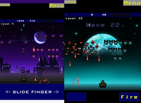
The iPad has more physical room to accommodate the player's fingers and I didn't want to ignore that. Players can still toggle between control systems, but I prefer to start them off with the one best suited to their device.
Obviously iOS phone/tablet detection is much easier than Android device detection due to the limited quantity of different iOS screen sizes. However, depending on the language you are using, it may be possible to detect the Android device resolution and DPI.
Then you can work out how physically large the device is and make decisions accordingly.
iOS screen sizes
In order to work out if the player's iOS device is a phone or tablet I simply check the screen resolution.
I'm using the Monkey-X language because it's cross-platform and highly modifiable.
Monkey-X allows me to get the device height and width and I use that data to a) determine which iOS device I'm running on, and b) detect which orientation is currently being used.
Currently I'm using five broad categories of iOS device based on resolution as follows:
- iPhone 3 (320x480)
- iPhone 4 (640x960)
- iPhone 5 (640x1136)
- iPad (768x1024)
- iPad Retina (1536x2048)
Note that the various iPod touch devices also fit into those resolutions and so do the iPad Minis. The new iPad Air comes in under the iPad Retina category.
As new devices come out I'll have to add them to my list if I want to do anything special with them.
Scaling the UI to fit
Obviously there are a lot of different device resolutions out there and I want my UI size and spacing to look good and be useable on them all.
A simple solution is to scale any UI graphics up or down relative to the screen size. It's important not to stretch the graphics in one direction more than the other as that looks bad such as when a 4:3 TV show is stretched to fit widescreen.
One thing worth bearing in mind is that if you have some nice big buttons that look good on an iPhone and then you scale them up on iPad, they can look clunky and amateurish. So what I prefer to do is use different button scales relative to screen size depending on if the game is running on a phone or a tablet.
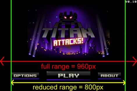
When spacing out buttons on a horizontal or vertical menu, it's best to calculate the available range and then use the scaled button sizes to work out what gap to use between the buttons.
However, if the range is very large - on an extra-wide screen for example - it's better to reduce the range so that the buttons don't look too spread out.
In the example below you can see that I've reduced the available range for the buttons to approximately 83 percent of the screen width.
Also, when placing UI elements on the edge of the screen or in corners it may be a good idea to use a border specified as a percentage of the screen width or height for example, 10 percent.
Changing UI orientation
Some developers prefer to lock the device to just one orientation because it's easier to code, and that's a valid strategy.
However, in my case I wanted to allow the player to play in either orientation especially on iPad because some people put it on their lap in landscape mode and others hold it in both hands in portrait mode.
My code constantly monitors the device width and height because, conveniently, Monkey-X updates theses values when the device is rotated to another orientation.
When a change is detected I simply call some code to reposition the GUI for the current screen.
The code doesn't reload any UI assets, it just moves all the UI elements (buttons, panels, controls etc.) to different positions depending on the orientation and device. This feels responsive and people seem to like it when they see it in action.
Be dynamic!
Of course, there are lots of fine details that are beyond the scope of this article, but hopefully I've been able to give you some useful pointers to get started.
One of the key things is to test on a wide range of device to see what your UI looks like, or configure your code to be able to run in completely different resolutions so that you can test out your dynamic UI code on your development machine.
I encourage you to incorporate a dynamic UI system into your own mobile game as it'll look more professional and will be easier to use on a wide range of devices. Good luck!
Jake Birkett is the owner of Grey Alien Games, an indie studio based in Dorset that specialises in casual games for mobile and desktop. He also runs the Full Indie UK meetup group.
You can get in touch with Jake via Twitter or find out more about Grey Alien Games on the company's website.


