The recipe behind Monopoly Go's art style

- How the team gave a game with a near-universal audience a distinctive look.
- Shin highlights the importance of art teams focusing on a single word to drive their style - for Monopoly Go, that was 'timeless'.
- Plus, a look at how the style held up through Marvel and Simpsons takeovers.
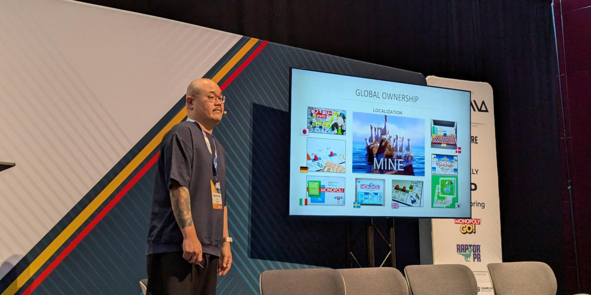
On day two of Pocket Gamer Connects Barcelona, Scopely VP of art Howard Shin took the stage to unpack the visual identity of Monopoly Go in the ‘Designing for Billions' session.
"How do you make capitalism fun?" Shin asked. "How do you make money for the pure sake of making money, fun?" Behind the question sat the real brief: how do you give a board game everyone already knows a fresh look, without losing the familiarity people love?
We unpack Shin’s methodology below, covering design, settling on a single principle, influences from other major brands and IP collaborations.
Designing for everyone
Monopoly's audience is effectively everyone and the brand is heavily localised. Shin noted that players in markets such as Denmark and Korea regard it as their own national game. That reach is also the central design problem: a visual identity built to please everyone risks turning generic, distinctive to nobody.
"How do we make a game and not follow the trap of building something for everyone that is for no one?" he said. The brief was to be specific without being narrow.
The organising idea: 'Timeless'
The team settled on a single organising principle: timeless. The reasoning drew on the brand's own history. Monopoly dates to the early 1900s, was mass-marketed from the 1930s and remains in use today, with mobile as the natural next step.
“It has to look fresh, feel fresh, play fresh, but at the same time pay homage to its history and its roots.”Howard Shin
"It has to look fresh, feel fresh, play fresh," Shin said, "but at the same time pay homage to its history and its roots."
The principle also set the test for everything that followed - each reference had to read as current now as it did decades ago.
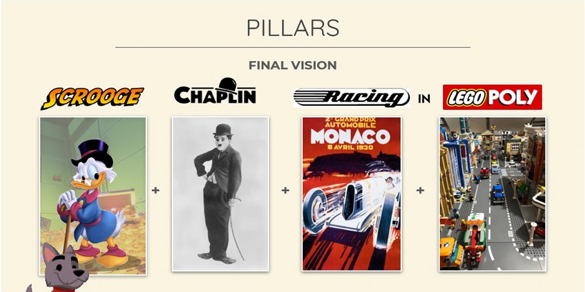
Four influences for 13 artists
The references Shin drew on came largely from the same era as the brand. They became the project's pillars, which the 13 artists working on the project took away to develop concepts from, checking each against whether it met them.
Charlie Chaplin. Silent-era physical comedy, defined by exaggerated, snappy movement that reads without dialogue. Shin noted it is still applied in animation today, which made it feel timeless.
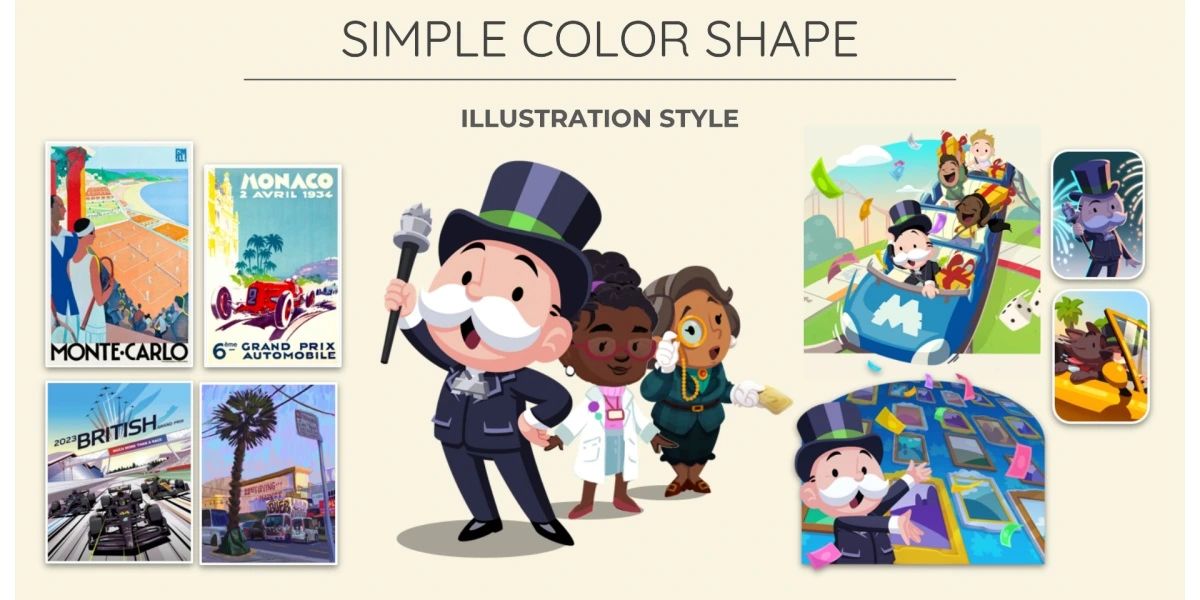
1930s posters and painting. Limited print technology pushed designers towards bold shapes and flat colour, using colour itself to imply volume and depth. Shin linked that approach to the graphic style of modern Formula 1 design.
LEGO. Founded in the 1930s, LEGO "collaborates with everybody and anybody," Shin said, while staying visually consistent. Similarly, Monopoly Go had to stay recognisable across every theme and region.
DuckTales. The cartoon informed tone, providing a template for treating wealth as playful rather than cynical. This was Shin's answer to making the game's money-driven premise fun.
The references were condensed into a single short slogan: 'Charlie Chaplin Racing in Legopoly.' This was intended to be memorable enough for the artists to apply when assessing any asset.
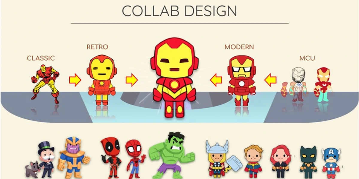
Stress-testing the style: Marvel and The Simpsons
Post-launch IP collaborations tested whether the identity could hold under other brands.
Marvel, the first, used classic comic book art rather than the film franchise. For Iron Man, the team worked between cinematic and vintage versions to find a middle that read as Marvel without anchoring to one era.
The new Simpsons collaboration is a full takeover of the game world. "The IP here was the art," Shin said, noting that fans associate the show primarily with its visual style. That collaboration is currently live.
At the end of the talk, Shin took a few questions from the PGC audience.
Did the characters originate in gameplay or design?
Shin called the relationship between the two hard to separate. He contrasted it with studios where art is "a central resource" that simply executes a brief: "You want a unicorn, I'll give the best unicorn you've ever seen."
On Monopoly Go, he said, "design and art, they're intertwined": "It's almost like 1% of an idea, the other person builds on it," - a mesh of ideas coming together.
How much time went into research?
"I was given at least a month and a half to just focus on this," Shin said, putting the full span at "about a month and a half to two months".
Much of that was editing down: "there's a lot of editing, shifting," and the slogan in particular had to be tight. "I didn't make a slogan to be a paragraph… it had to be one sentence, snappy."
He also worked through earlier material: "There was a mountain of art that I needed to look at to see if there was something there that I should be utilising or inspired by."
How closely did art work with product?
Closely. "I was adamant that the art also needs to serve the game," Shin said, which meant it had to be backed by a clear product vision. With that vision still being established early on, he spent a lot of time with the product team. Meetings, as he put it, were put in place to understand "what product is thinking about" for "the next chapter" of the game.
Companies
People